Case Study: Travel & Loyalty
Reimagining a Member Booking Experience
The UX Design team and I worked with Arrivia's Fortune 500 partner to reimagine their travel website for members. The existing platform was outdated and overwhelming, and it failed to help members understand or use their benefits. Our redesign was built on two rounds of user research and produced a modern, member-first experience across hotel, air, resort, and cruise booking.
See Final Results ↓
Problem
What wasn't working
The partner's travel website was outdated and lacked the basic UX foundations needed to engage users. Members had a hard time understanding their benefits and figuring out how to apply savings credits to bookings. That was the whole point of the membership, and the original design made it nearly invisible.
Solution
How we fixed it
My team and I stripped things back and started fresh. The original site was overwhelming and failed to build trust, so we focused on clarity. I worked on the deal cards and the welcome experience to surface member value right away. We built a member onboarding flow, redesigned the currency bar to update in real time, and created a benefits library so members could actually understand what they had.
Tools
Figma, Miro, Maze
Team
2 UX Designers · 1 UX Researcher · 2 Project Managers
My Role
UX Designer
Timeline
20 weeks
Design Process
Discovery
Research
Define
Design
Test & Iterate
Discovery
Understanding the Existing Platform
Audited the existing booking platform to identify usability failures and missed value propositions.
Talked to stakeholders to understand business goals, member segments, and known pain points.
Mapped the member journey from login to booking completion, finding where users dropped off or got confused.
Reviewed competitor travel platforms to understand what was working in deal presentation, onboarding, and benefit communication.
Before
Original Website
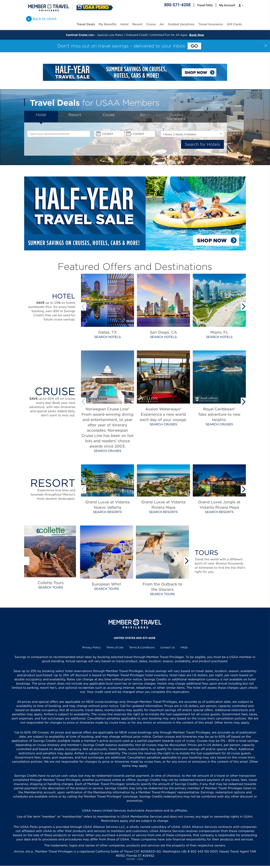
Original Website
The original platform: outdated, visually overwhelming, and hard to navigate
Research
Initial Usability Study
Before redesigning, we ran a usability study on the previous team's designs with 15 participants to understand where the experience was breaking down.
7 of 15 users could not complete tasks involving member savings credits. The currency bar was a consistent pain point.
The currency bar did not update after bookings and failed to explain different currency types.
Deal cards were frequently missed or ignored when placed below the fold.
Users expressed low confidence when navigating between booking categories (hotel, air, cruise).
Process
Design
Design
Sketches
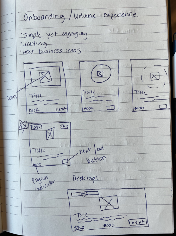
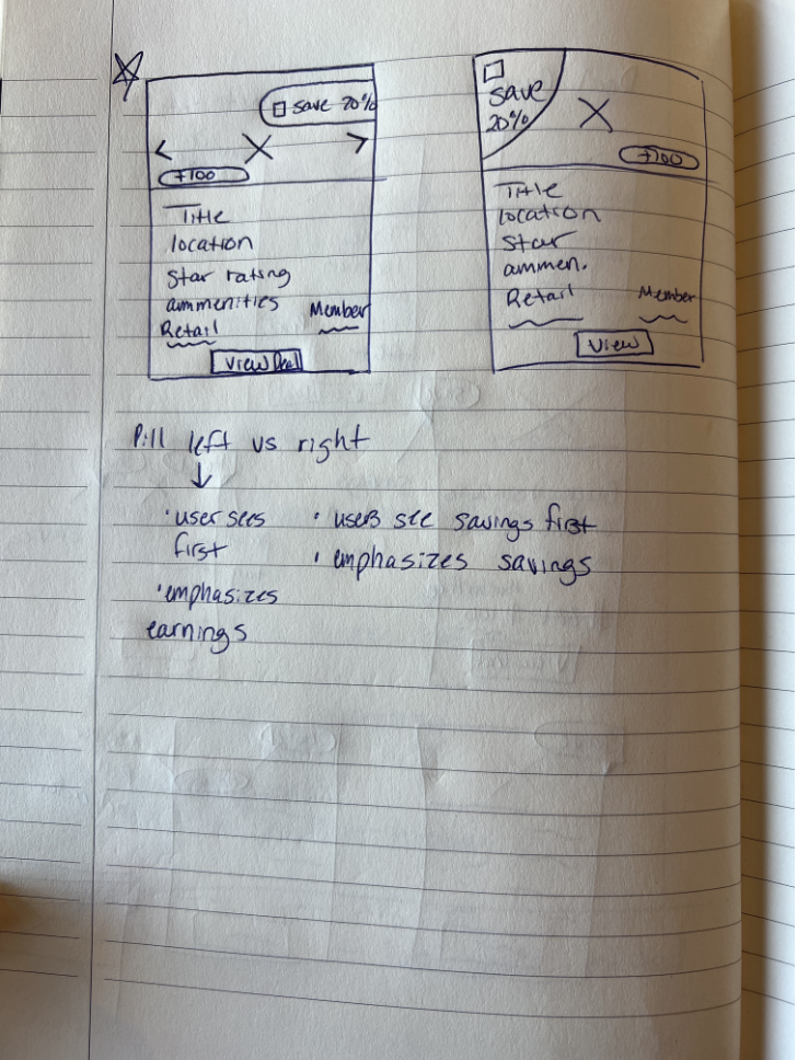
I began with rapid paper sketches to quickly explore layout directions before committing to digital wireframes. Sketching allowed me to think freely about structure, hierarchy, and user flow without getting caught up in visual details early on.

Design
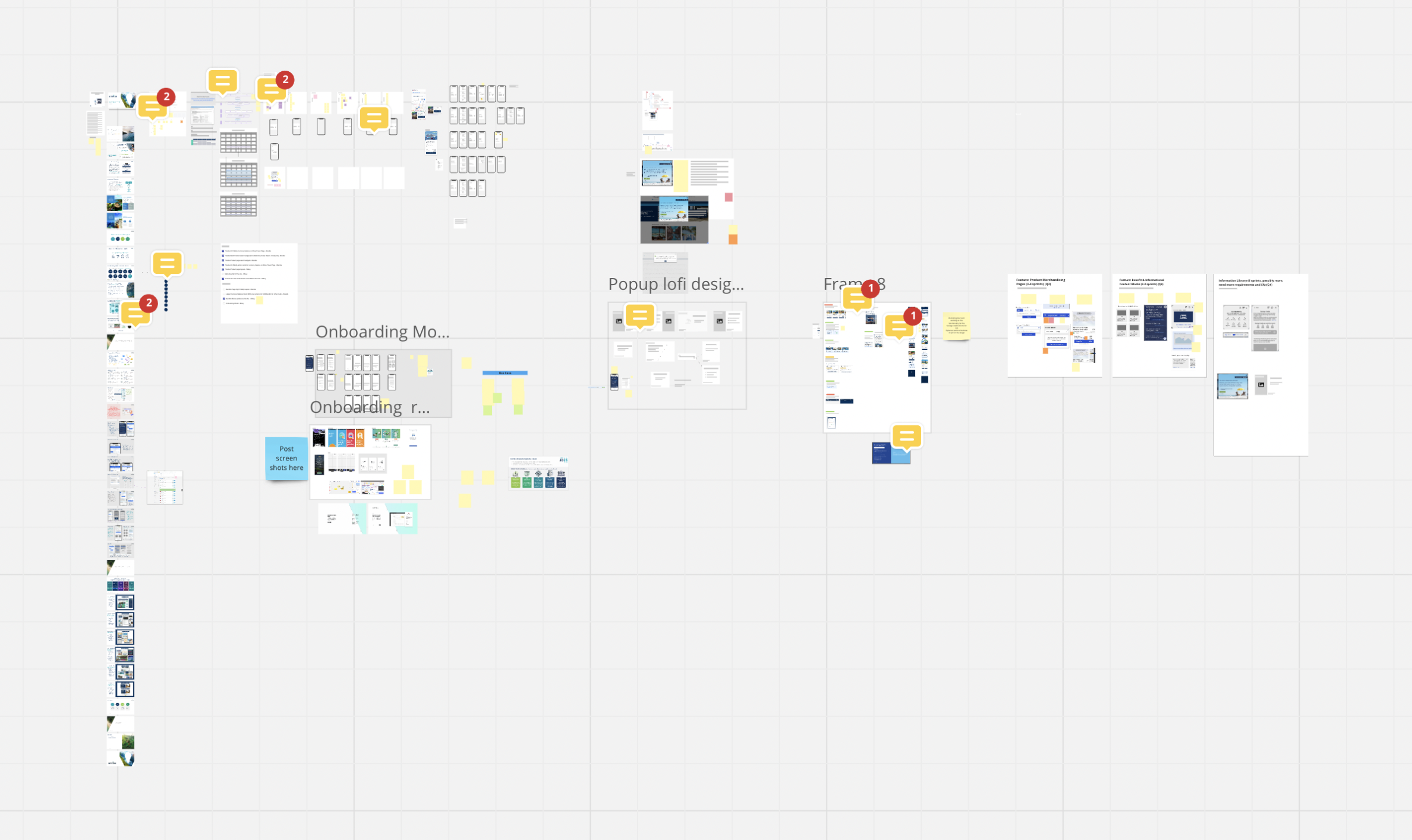
Information Architecture
Design
Wireframes
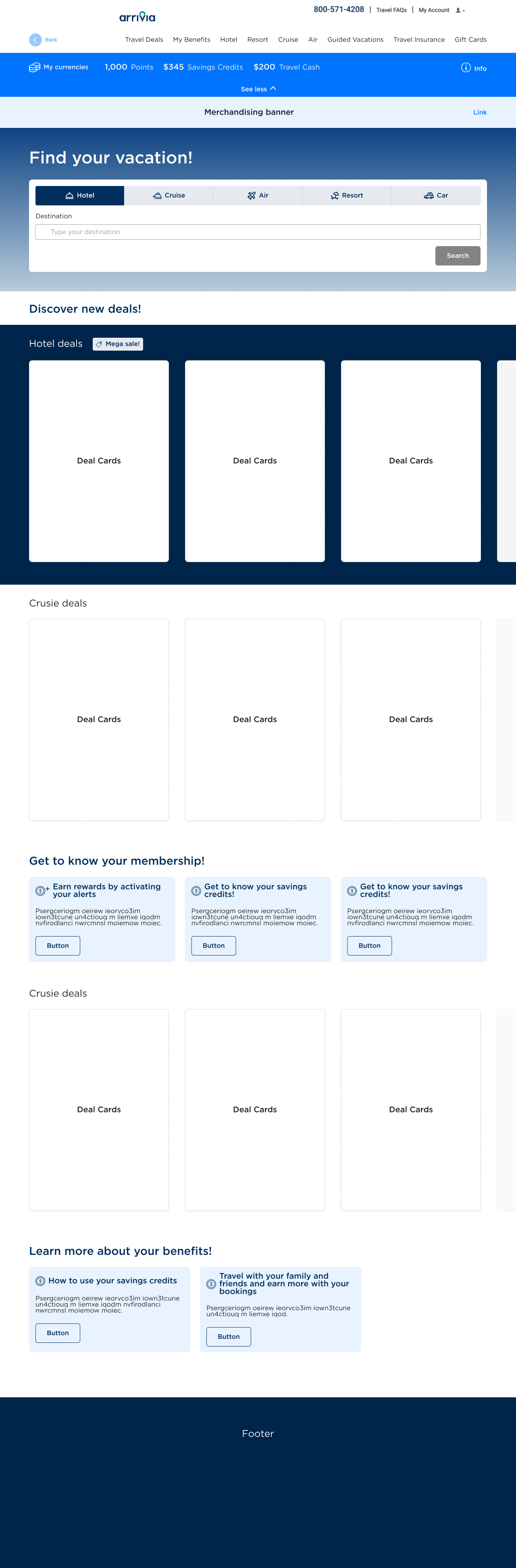
Low fidelity wireframes helped lock in structure before any visual decisions were made. I focused on surfacing member value above the fold (deal cards, currency balance, booking CTAs) and restructured navigation to cut down the steps between login and booking.

Design
Mid Fidelity Designs
Mid fidelity designs brought structure to life with real content, spacing, and component relationships. These drove our first round of stakeholder reviews and helped us figure out where to focus in high fidelity: the booking flow and member dashboard came first.
Final UI
High Fidelity Designs
Final UI
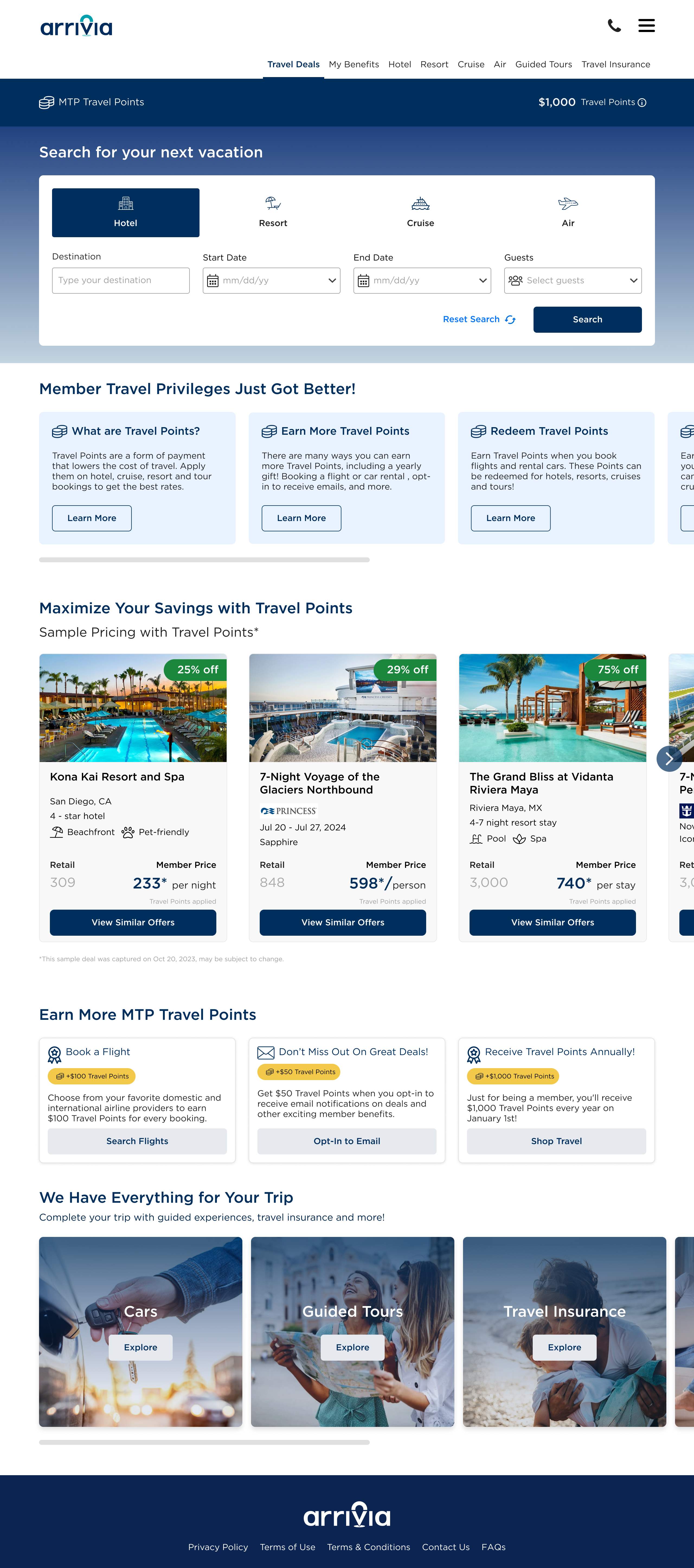
Shop Travel Landing Page
The redesigned landing page surfaced deal cards prominently above the fold, with a currency bar that updated in real time. I restructured the page hierarchy so members could quickly understand what they could book and how their credits applied, which cut down the friction that caused drop-off in the original.
Final UI
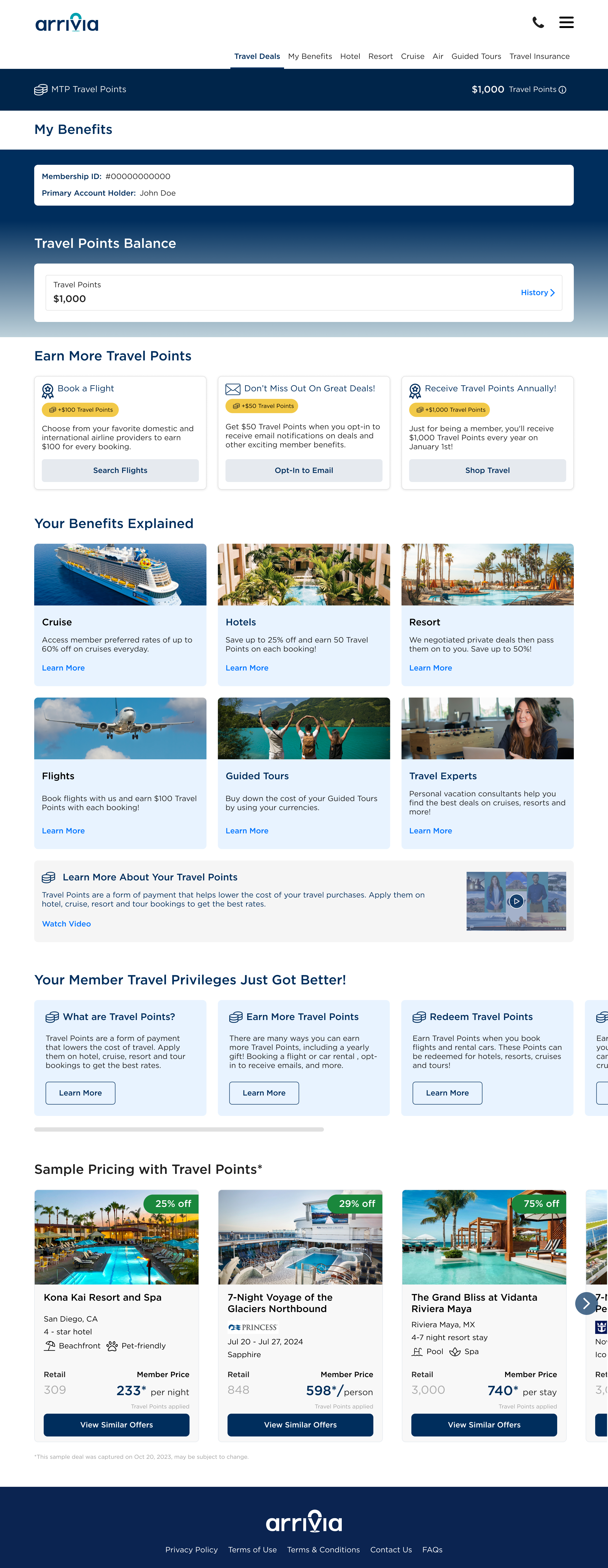
My Benefits Page
The benefits page gave members a clear place to understand what they had access to, how their credits worked, and how to use them. In the original product, members rarely understood their membership value. This page fixed that.
Final UI
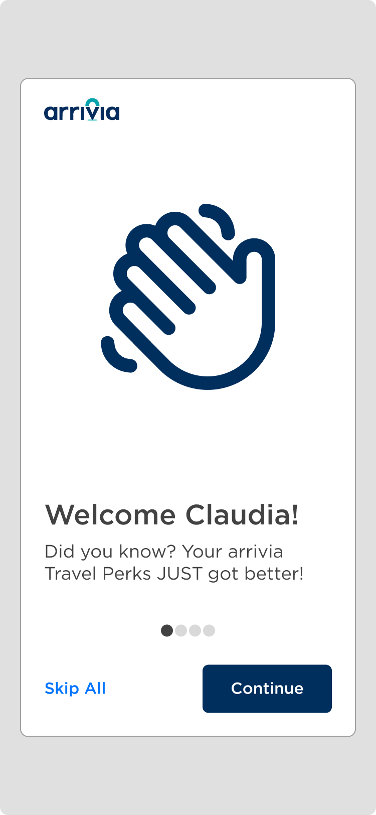
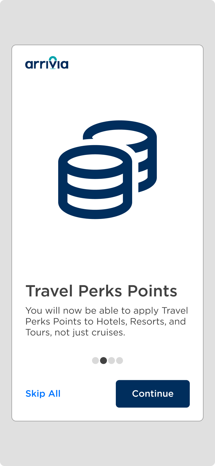
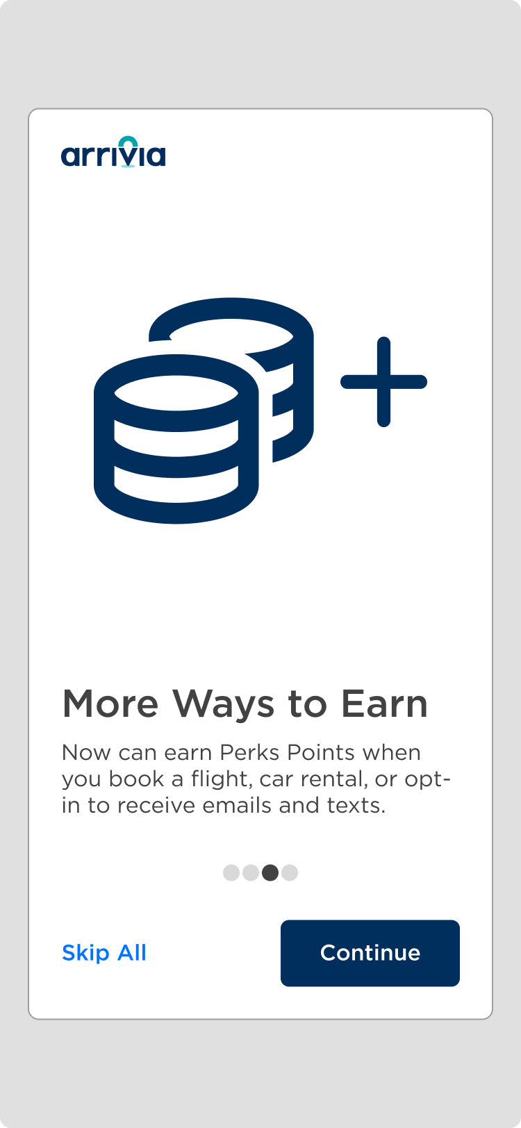
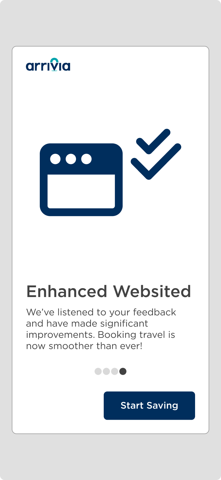
The Onboarding Experience
We built a member onboarding experience to introduce users to the platform, covering the types of credits available, how savings apply to bookings, and where to start. The flow landed well in testing: 5 of 9 external users engaged with it and left positive feedback.
Research
Usability Testing
After our first redesign round, we tested with 9 internal travel agents over two weeks. This validated our structural changes and surfaced smaller interaction issues before we moved to external users.
The updated currency bar was understood immediately by 8 of 9 participants, a significant improvement over baseline.
Deal cards placed above the fold saw strong engagement; participants noticed and interacted with them unprompted.
Navigation between booking categories (hotel, air, cruise) was rated as clear and intuitive by all participants.
Minor issues with the onboarding skip flow were flagged and addressed before external testing.
Research
Usability Testing: Second Round
The second round brought in 9 external users over 3 weeks, giving us real-world feedback from actual members.
SUS score rose from 62 (original site) to 80 (round 1) to 83 (round 2), approaching the 85.5 benchmark for excellence.
5 of 9 external users engaged with the onboarding experience and provided unprompted positive feedback.
The "My Benefits" page was cited as a valuable addition by 7 of 9 participants who said they had never understood their credits before.
Overall task completion rate reached 70%, up significantly from the baseline.
Priorities
Priority 1
Surface member value immediately on login. Credits, deals, and savings should be visible before anything else.
Priority 2
Fix the currency bar: update it in real time and clearly explain each credit type and how it applies to bookings.
Priority 3
Move deal cards above the fold. Every other design decision was measured against whether it served these priorities.
Final UI
UI Design (Ongoing Designs)
As the platform evolved, I contributed UI designs across additional booking flows and account management screens. The template was later picked up for other Arrivia client accounts, and I built a design toolkit that let the account management team present the system to new clients on their own.

Learnings
Working on a Fortune 500 platform reinforced how much unclear value propositions cost. If users can't understand what they have, they disengage regardless of visual polish.
Research-backed iteration saved real time. Validating structural decisions before high fidelity meant we didn't have to rebuild work.
A solid onboarding experience doesn't just orient users. It sets their expectations and builds the confidence they need for everything that follows.
Next Steps
Expand the design system template to additional Arrivia client accounts with brand-specific theming.
Run a third round of usability testing with real booking scenarios to validate the full end-to-end flow.
Build out the service detail pages for hotel, air, cruise, and resort to match the quality of the redesigned landing page.
Introduce A/B testing on deal card layouts to optimize for booking conversion.
Results
Business Impact
The redesigned platform improved both member engagement and comprehension. SUS scores rose from 62 on the original site to 83 after two rounds of work, approaching the 85.5 benchmark for excellence. The design template was adopted across other Arrivia client accounts, and I built a toolkit that let the account management team present the system to new clients on their own.
62 → 83
SUS Score improvement approaching excellence benchmark
70%
task completion rate up significantly from baseline
5 / 9
external users praised the onboarding experience
Thank you for reading my case study!
Let's share ideas & discuss ways to collaborate!
Contact meRead more of my case studies