Case Study: Healthcare
Designing the First Step Toward Therapy
Redesigned the Peak Psychological homepage to help prospective clients find the right care and reach out with confidence. Delivered clean handoff designs that improved clarity, credibility, and new client inquiries.
See Final Results ↓
Overview
About the Project
Peak Psychological Service needed a homepage and marketing landing page that actually matched the quality of care they provide. The existing page made it hard for visitors to understand what was offered, trust the clinic, or take any next step. I led the redesign as the sole UX Designer, owning the process from early exploration through final UI and handoff. My focus was turning anxious, information-seeking visitors into confident prospective clients by clarifying offerings, strengthening trust signals, and making it easier to get in touch. I also produced developer-ready screens and specs so the team could build with fewer questions. The work resulted in a cleaner homepage and a measurable lift in new client inquiries.
Problem
What wasn't working
Prospective clients arrived on the homepage feeling uncertain, and the page gave them little to work with. Key information was easy to miss: what the clinic offers, who it helps, and how to get started. There were not enough trust signals for a decision that is already hard to make. Visitors left without taking action, and the clinic missed potential inquiries.
Solution
How I fixed it
I redesigned the homepage and landing page around a clearer decision path: what Peak offers, who it is for, and how to book or contact. I introduced stronger information hierarchy, scannable sections, and clearer calls to action so users could act without hunting. I added credibility cues (team highlights, reassuring microcopy, and proof points) to reduce anxiety and build trust. I delivered developer-ready designs and handoff notes so the team could build accurately.
Goals
What success looked like
The clinic wanted these pages to do more than look polished. They needed to help real people take a hard first step toward care. I worked with stakeholders to make the page easier to scan, easier to understand, and easier to act on across devices. I focused on building credibility quickly, since trust is a big part of whether someone decides to reach out. I also aimed to deliver clean, implementation-ready designs to cut down on dev back-and-forth.
Role
UX Designer
Tools
Figma, Affinity
Team
UX Designer (me), Project Manager
Timeline
4 weeks (design to handoff)
Design Process
Setting Goals / Before
Research
Wireframes
Final UI
Business Impact
Project Goals
Goal 1
Increase homepage-to-inquiry conversion by making the primary calls to action clearer and easier to find.
Goal 2
Cut confusion by making services and next steps scannable within the first screen.
Goal 3
Build perceived trust and professionalism, validated through stakeholder feedback and fewer clarification questions from prospects.
Research
User Journey
The journey usually started with a search, then a quick scan of the homepage to judge fit in a matter of seconds. Visitors looked for reassurance first, then practical answers: what services are offered, who the clinic works with, whether insurance is accepted, and how easy booking is. When those answers were not easy to find, people left or put the decision off. I used that journey to shape a homepage flow that prioritized immediate clarity, then layered in detail for visitors who needed more before reaching out.
Before
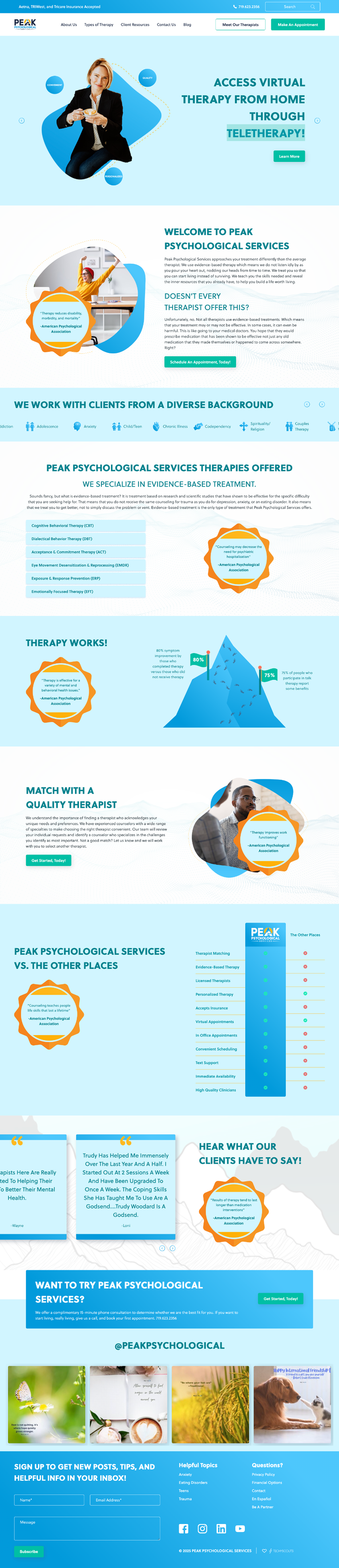
Original Landing Page
This was the landing page we started with. It did its job, but it was hard to tell at a glance what the product was and what someone should do next. This baseline helped me spot the gaps and set clear priorities for what to improve.
Before
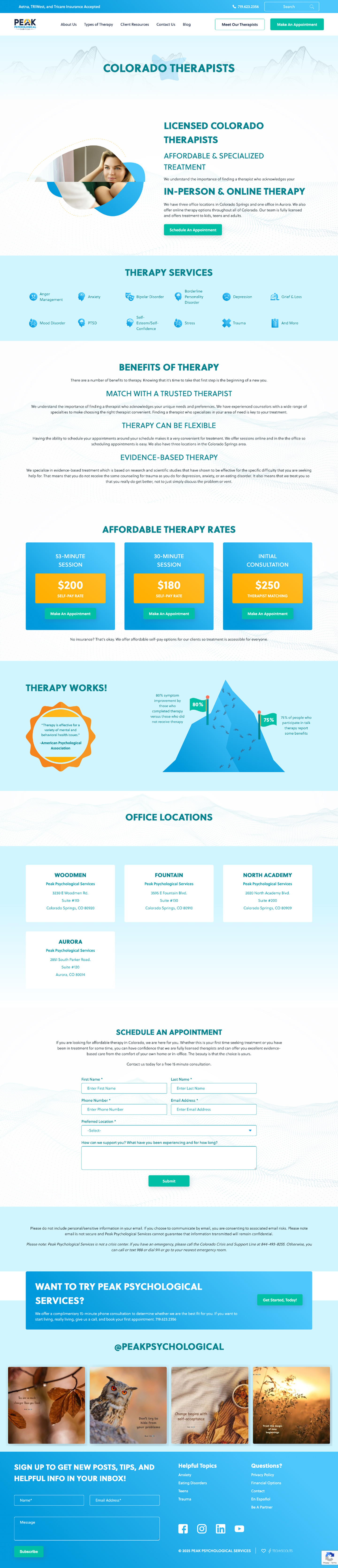
Original Marketing Landing Page
Starting as a simple marketing landing page, I used it to focus on what matters most: a clear message, a smooth flow, and easy next steps. I tested different lengths and layouts until the content felt natural to scan, whether someone reads every line or just skims. The goal was simple: make the page look good, read well, and guide people to click.

Research
Competitive Research
We looked at four direct competitors and built a comparison matrix across 45 criteria, including Nielsen's heuristics. The goal was to understand what was working elsewhere so we could find the gaps and design around them.
Design
Wireframes
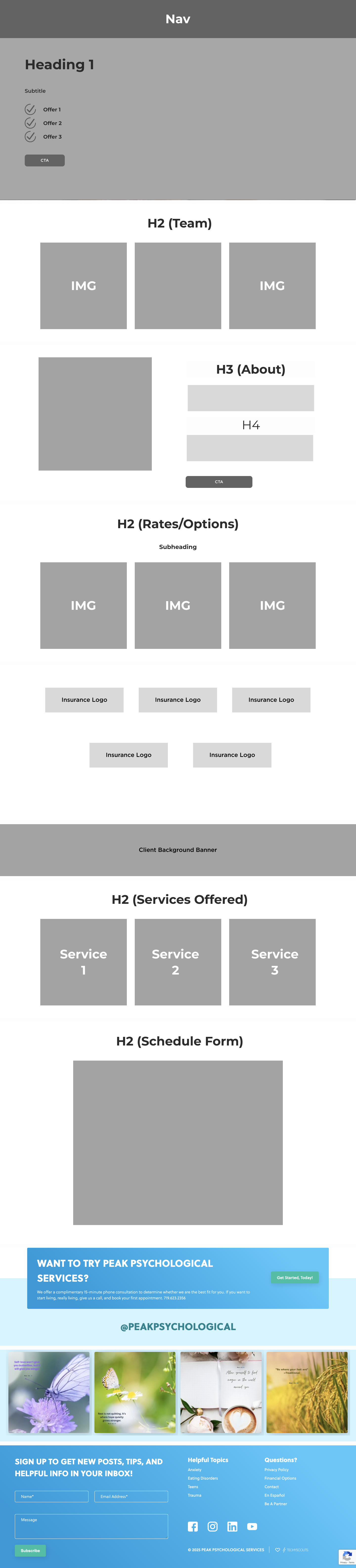
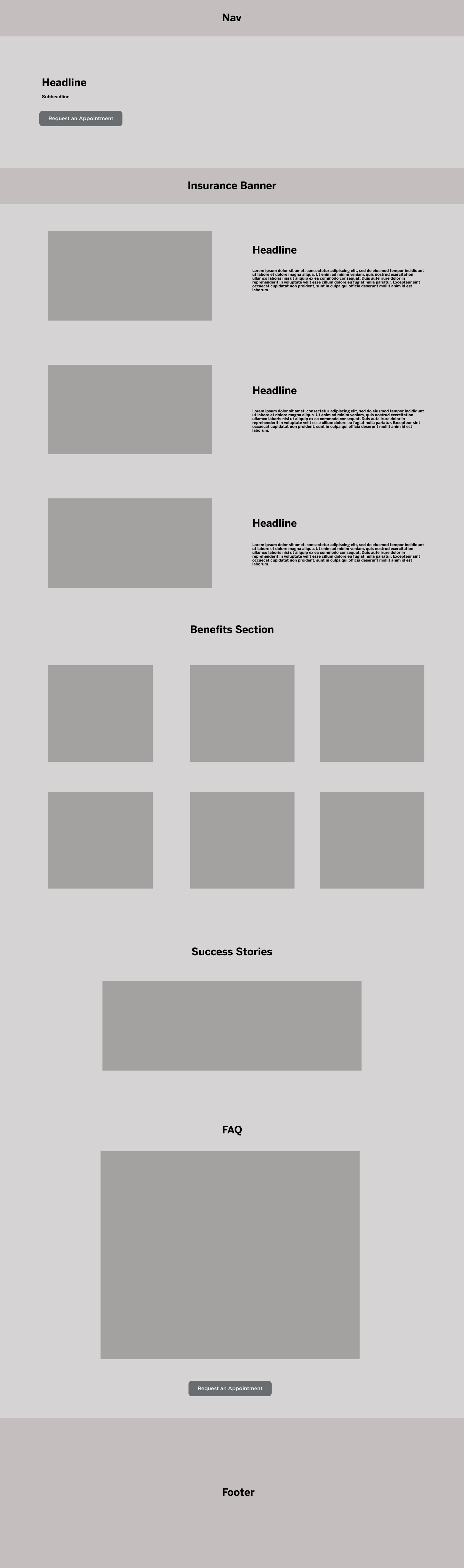
I started with low fidelity wireframes to lock in structure before any visual decisions were made. I explored multiple above-the-fold layouts to find the right balance between empathy and clarity, testing different headline approaches, service entry points, and contact actions. The middle sections were built for scanning: short blocks for services, approach, and credibility rather than long paragraphs. Once the structure held up in stakeholder reviews, I moved into detailed layouts for handoff.
Final UI
UI Design
The final UI was designed to feel calm, professional, and approachable, matching the clinic's tone while making everything easier to read. I used clear type hierarchy and generous spacing so someone in a stressful moment could scan without feeling overwhelmed. I placed consistent calls to action (book, contact, request a consult) after key reassurance content so users could act when they were ready. Trust-focused components included clearer service summaries, clinic proof points, and microcopy that made starting therapy feel less daunting.

Homepage Final UI
Final UI
Desktop UI
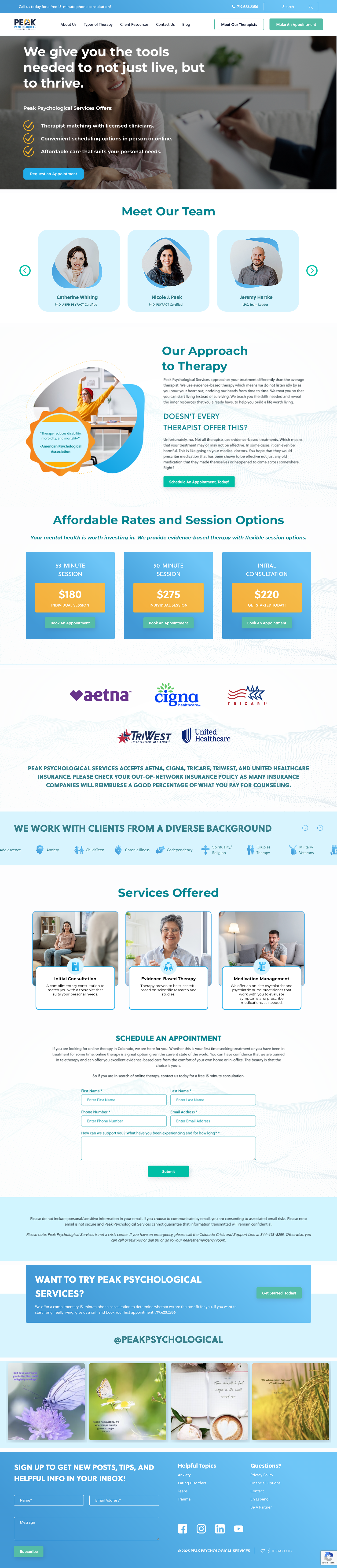
Desktop UI: Homepage
Learnings
Designing for mental health requires paying attention to emotional state, not just tasks and clicks.
Small hierarchy choices, like how sections are ordered and where CTAs land, have real impact on whether someone feels ready to reach out.
Clean specs and states up front protect design intent and prevent rework during implementation.
Next Steps
Run usability testing with first-time visitors to see how quickly they grasp the services and next steps.
Add lightweight analytics events (CTA clicks, scroll depth, form starts) to understand what drives inquiries.
Extend the redesign to service detail pages so the homepage promise carries through.
Results
Business Impact
The redesigned homepage made it easier for visitors to understand the clinic and know what to do next. Stronger trust cues and a clearer first step helped more people move from browsing to reaching out. The development team also worked with cleaner deliverables, which cut down on back-and-forth during implementation. The homepage contributed to a meaningful increase in new client inquiries.
18%
increase in inquiries from the homepage
22%
increase in CTA clicks (contact, booking)
15%
reduction in bounce rate on the homepage
Drop me a message
Let's share ideas & discuss ways to collaborate!
Contact meRead more of my case studies