Case Study · Non-Profit
Building a Home
For Those Who Serve
Tools
Figma · Squarespace
Team
2 UX Designers
My Role
UX Designer · Researcher · PM
Timeline
8 weeks
Overview
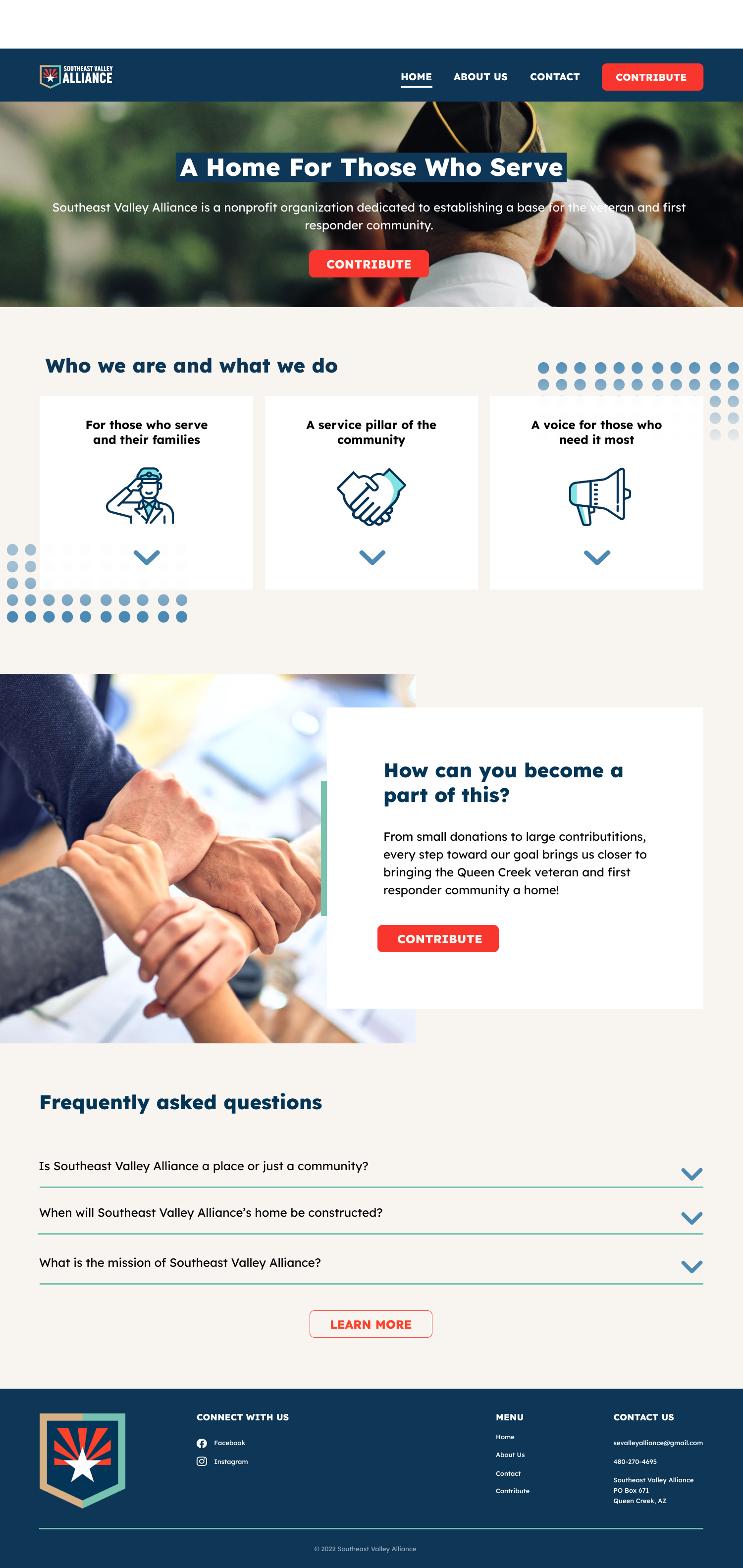
The Southeast Valley Alliance is a non-profit in Queen Creek, Arizona that supports U.S. military veterans, active duty service members, their families, and first responders. Our team built a website to help the organization fundraise for a new community center. I came onto the project mid-stream, conducted original user research to validate and improve the existing designs, and delivered a live site built in Squarespace.
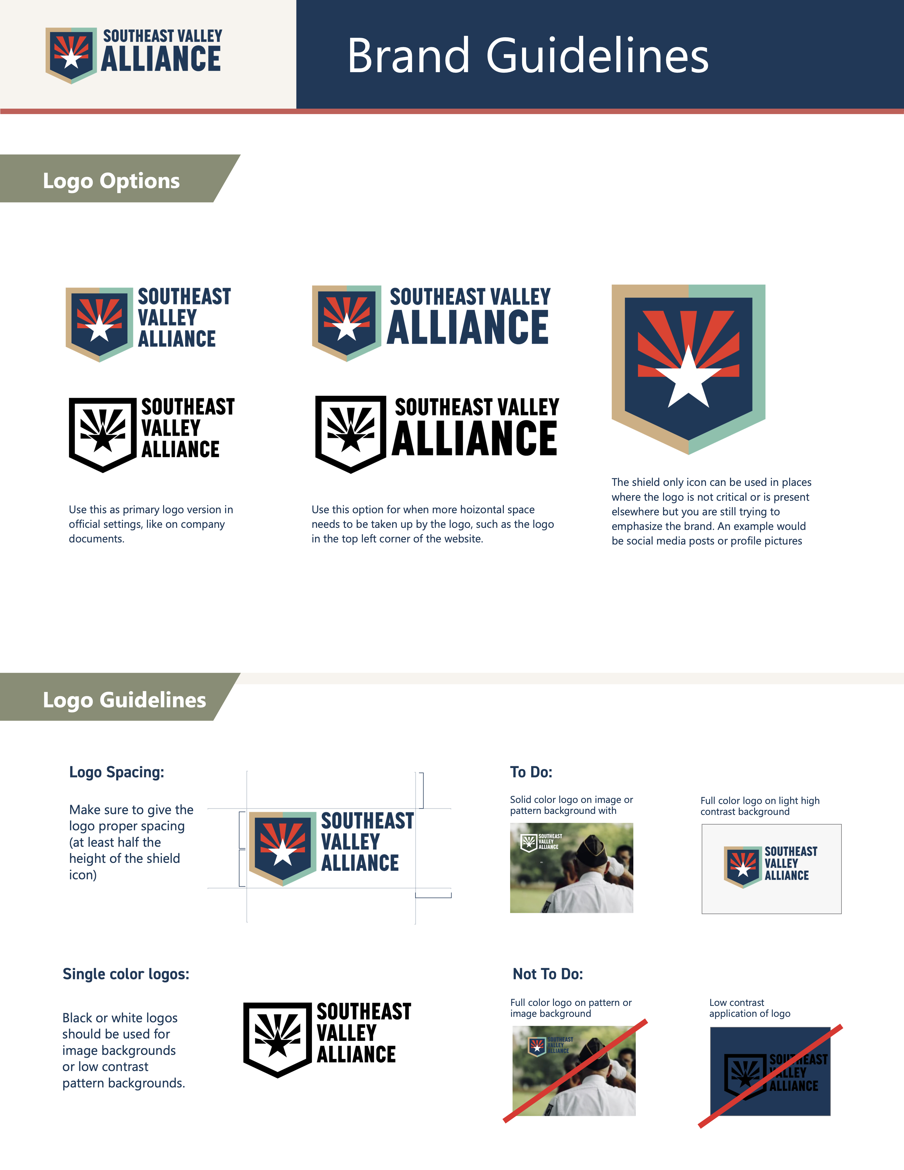
The previous team had created initial branding and mockups. My job was to validate those designs with real users, refine what needed fixing, and build and launch the final site in Squarespace.
Prototypes
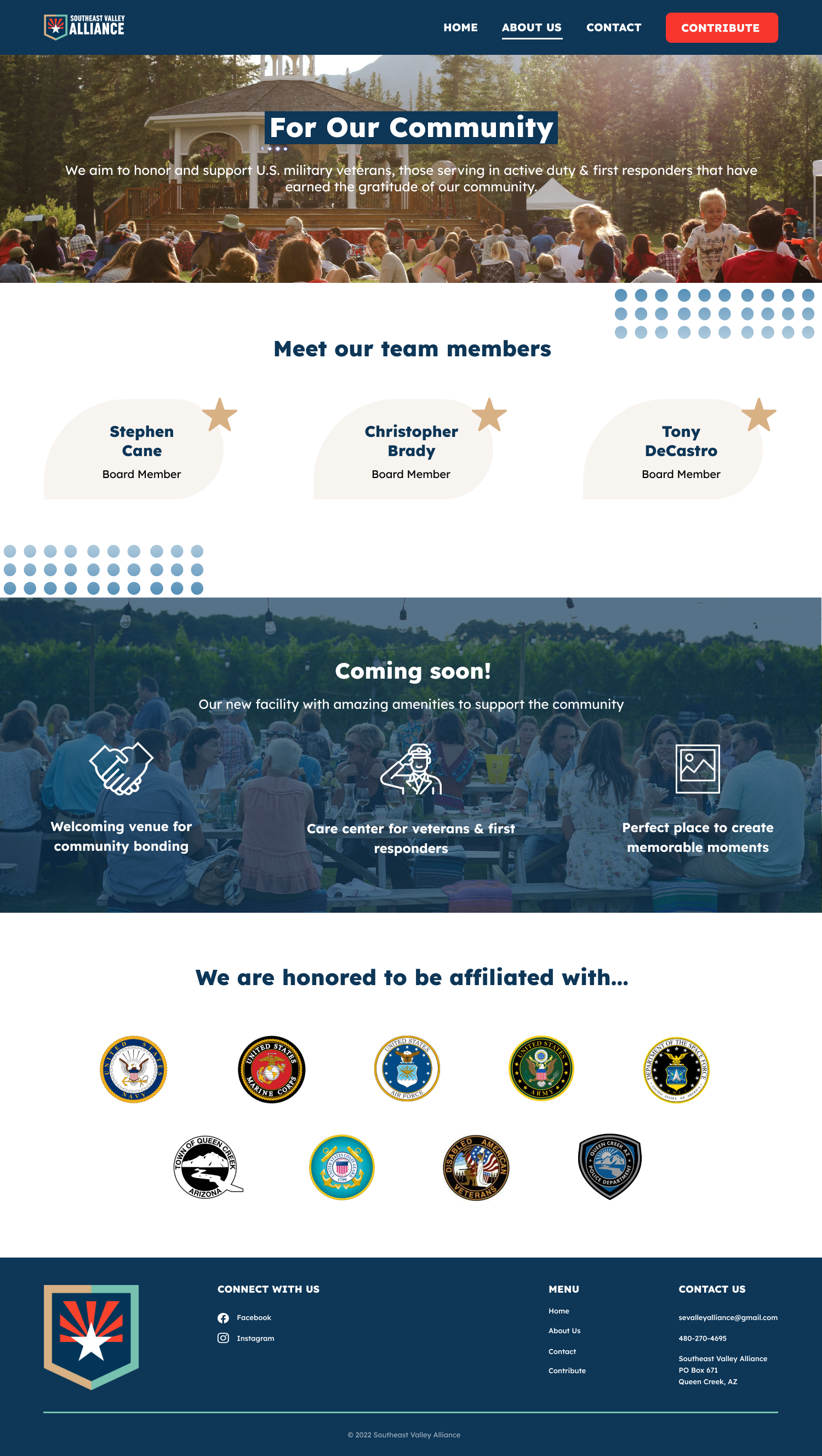
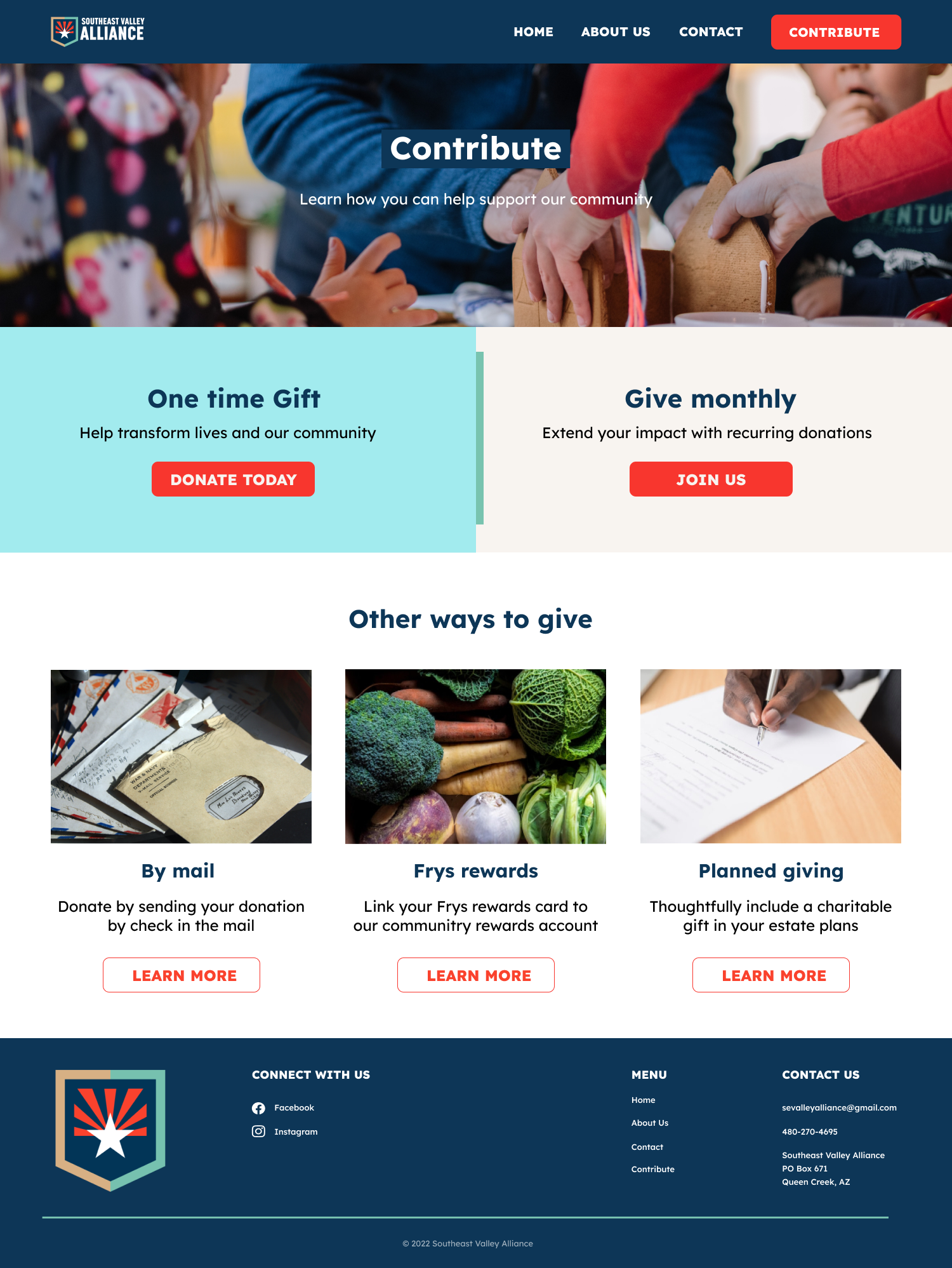
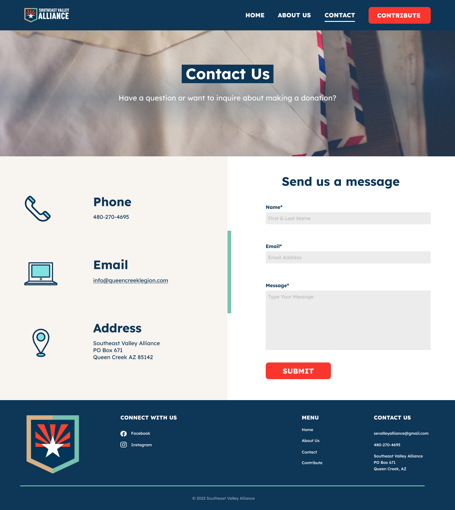
These are the designs the previous team handed off. My role was to test them with real users to find out what was working and what needed to change.
Branding
Research
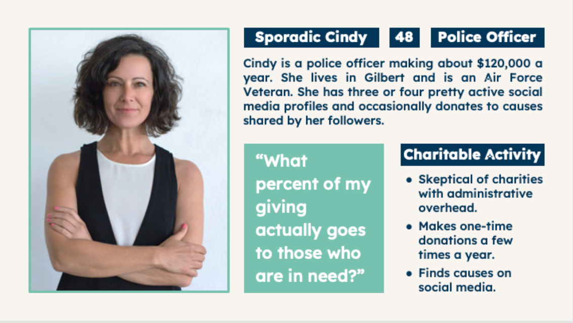
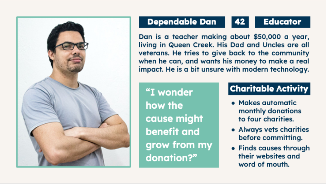
To understand the target audience, we ran a survey targeting veterans, first responders, and regular donors. Here's what we found:
- Age Range: 40s – 50s
- Majority Male
- Household Income: $100,000–$200,000
- Majority have a military affiliation with the military, veterans, or first responders
- Credibility of a site is the most important factor when considering donating
Personas
User Testing
We ran usability tests to see how first-time visitors would engage with the site and find out what needed improvement.
User Testing: Home Page
- Users had a good first impression and thought the site was laid out well.
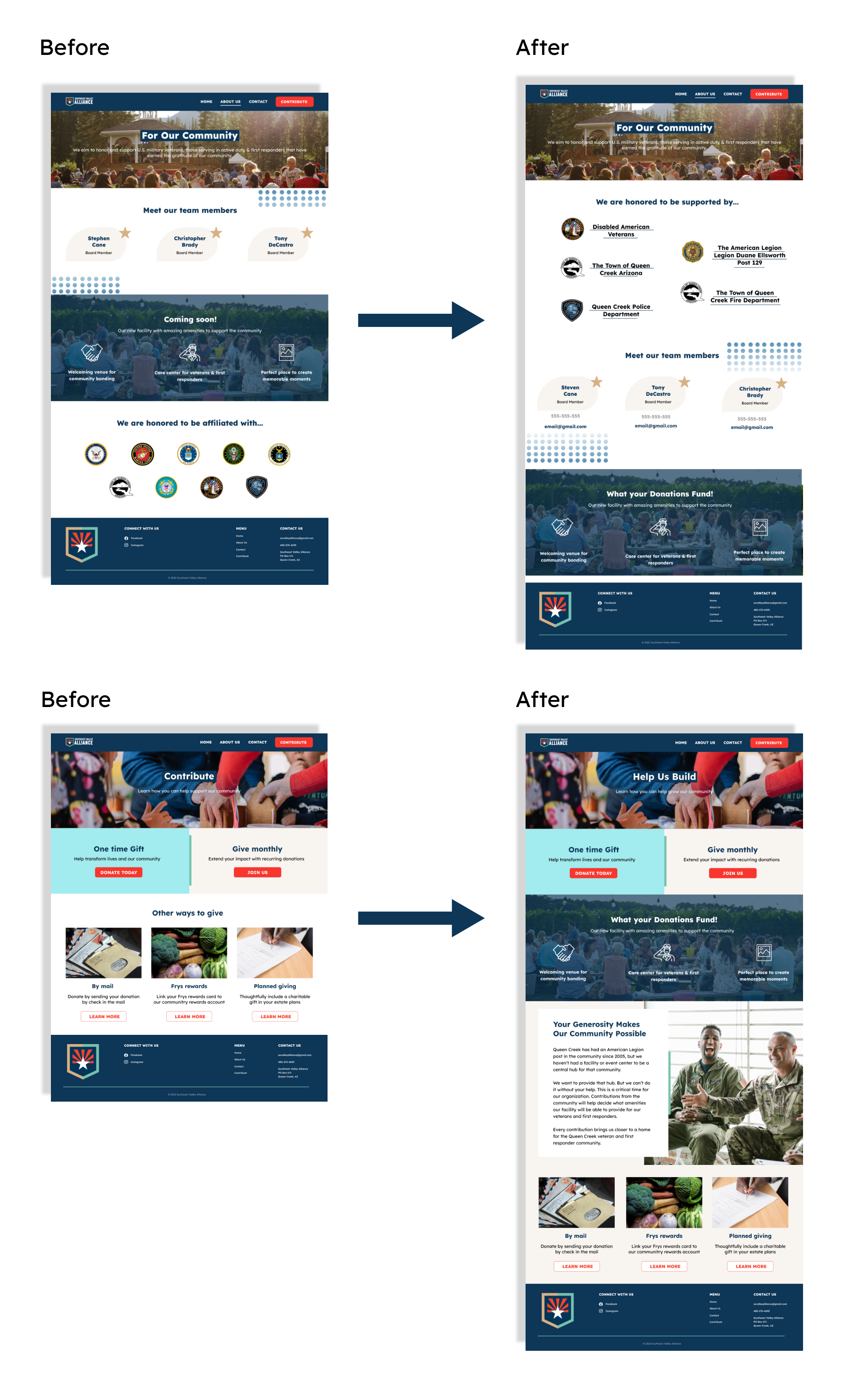
- The site could be more credible.
- "Southeast Valley Alliance" affiliation being more apparent would greatly help.
User Testing Highlight: About Us
- Users understood who the Southeast Valley Alliance was.
- Some read the organization as a military recruiting agency, which needed to be addressed.
- Users questioned the organization's credibility.
- The copy needed to make clear this was a support organization, not a recruiting one.
User Testing Highlight: Donation Page
- Users want to know exactly where their donation goes.
- More context on how donations are used would help users commit.
- Most users understood the Alliance's mission.
Our Solutions
With testing done, we redesigned based on what users told us. We restructured key sections to lead with credibility and revised the page hierarchy so visitors could understand the Alliance's mission quickly.
Client Meetings
We presented the completed designs to the Alliance's board members. They gave detailed, helpful feedback to align the designs with their goals, which we incorporated into the final version. With their sign-off, we felt confident the design was doing its job.
Challenges
Picking up mid-stream from another team is always tricky, especially under a tight timeline. The main thing was resisting the urge to jump into solutions before completing the research.
Finding the right testing platform and the right participants was harder than expected, but we gathered enough useful feedback to move forward with confidence.
Designing for a cause like this also carries the risk of bias creeping into the UX. We tried to stay grounded in what the research told us rather than our own assumptions.
What We Learned
- Skipping research, even when you're under pressure, costs more time than it saves.
- Credibility and trust are what move donors to act. The research confirmed it.
- Working directly with clients and incorporating their feedback is its own skill. This project sharpened that.
Final Website
View Live Site →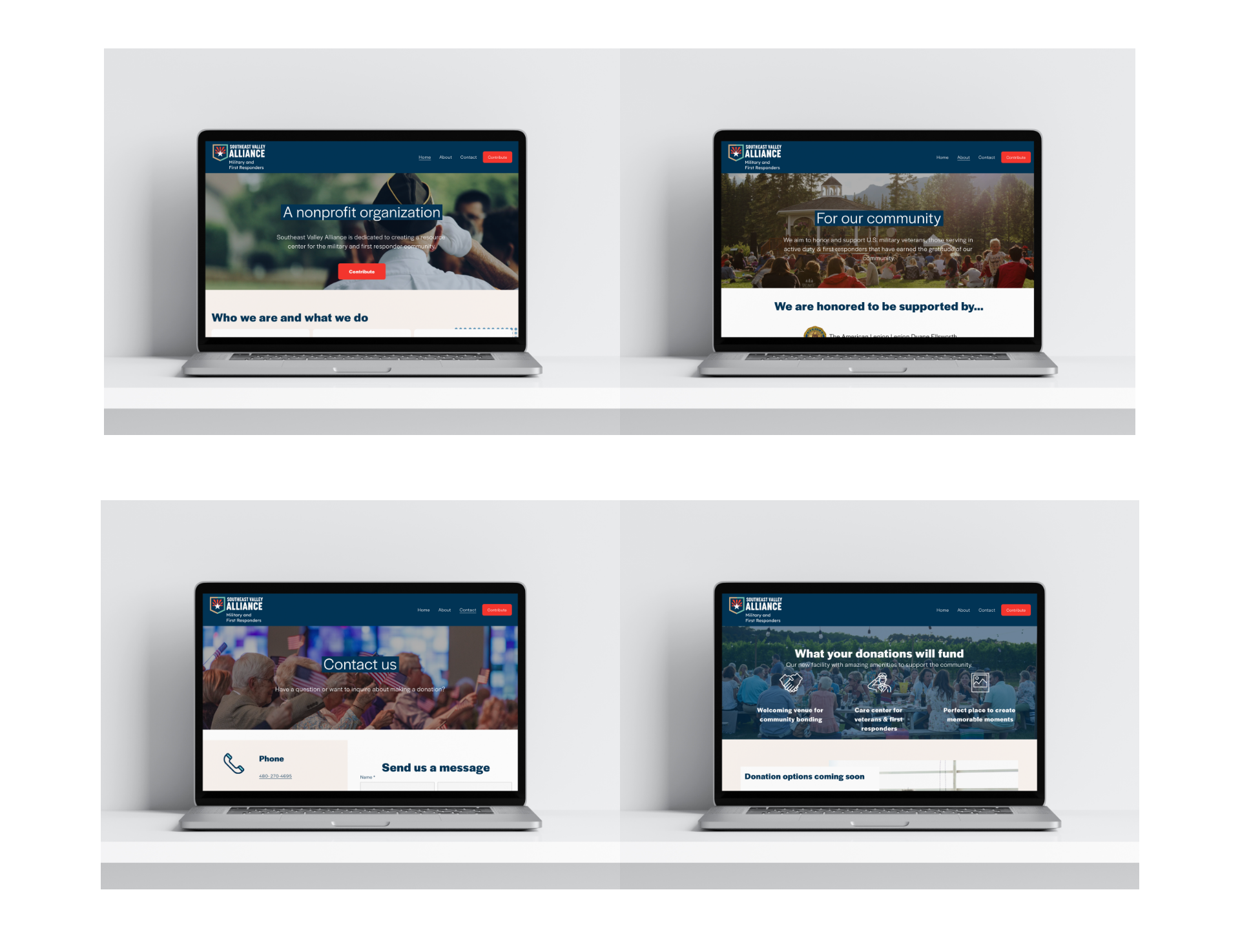
Read more of my case studies